|
PEANUT BUTTER CHOCOLATE BAR Target audience: 6-12 YEAR OLDS Concept Sketches Initial concepts were designed to be classic. Using peanut butter colours in the first, and a flourish of elegance in the second, both were quite minimal and I thought would be targeted at health-conscious adults looking for a naughty treat without breaking all the rules. 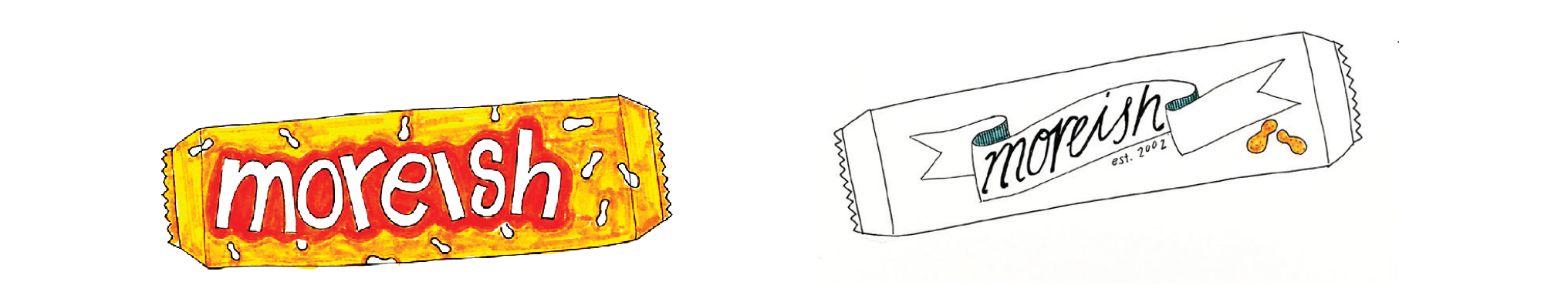 Adobe Kuler I explored swatches on Adobe Kuler that contained the bright, contrasting colours I was searching for whilst also including my peanut butter tones 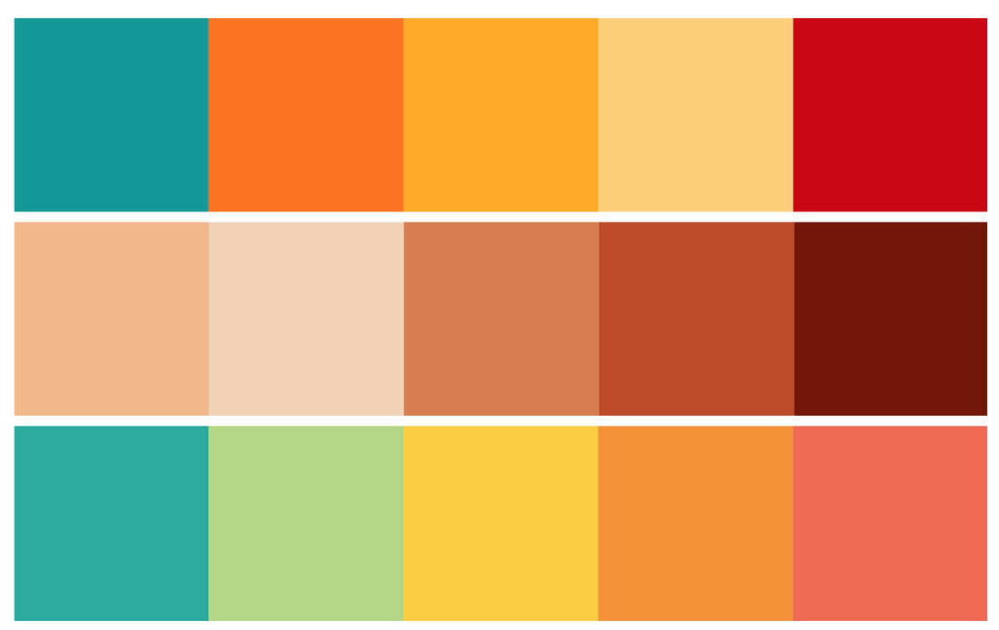 These fonts are bubbly, eye-catching and interesting whilst also having good readability. There is an element of fun and playfulness to them, making them suitable for the target demographic. 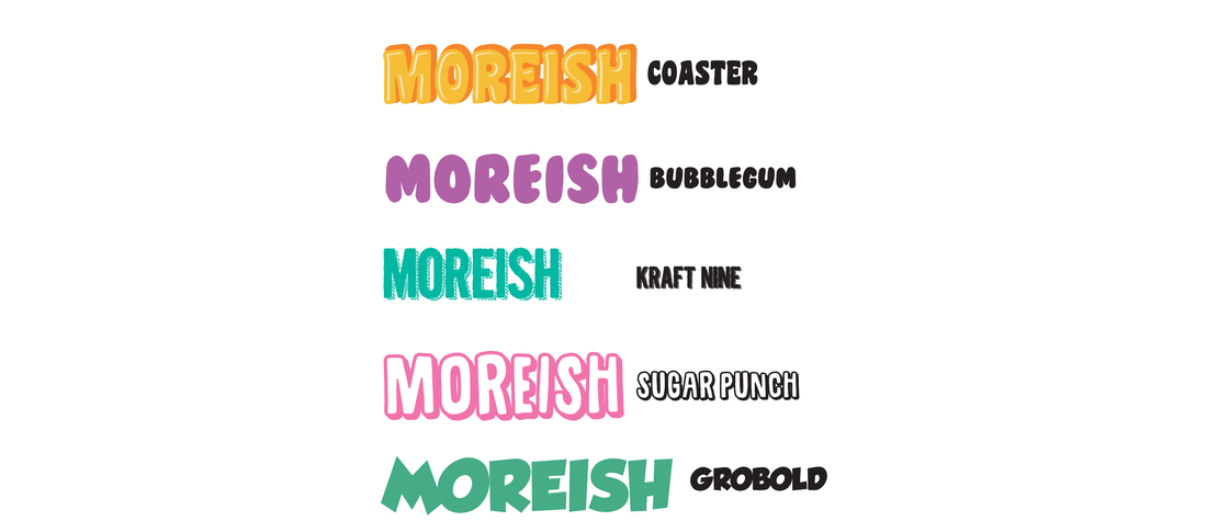 Experiment, experiment, experiment! I found that the more options I had to choose from, the better, in this assignment. So I experimented a lot with the typography, looking at all the warp effects and values, how each typeface responded to the effects. Once a font and style were chosen, it was taken into photoshop where further experimentation was done using layer styles. I used a gradient, colour overlay, drop shadow and outer glow to enhance my typography and make it appear to jump off the page. 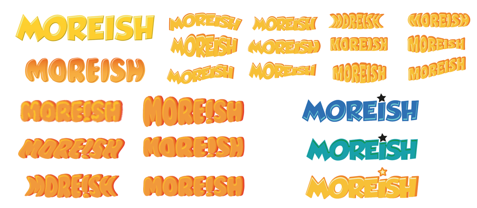 Before & After The first image is typography highlights and shadows created using offset paths in illustrator. The second is with additional layer effects in photoshop including drop shadows, colour overlay and outer glow. 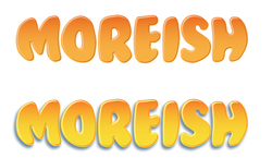 Design Elements I wanted to portray peanut's heavily throughout the design, not only in the product illustration. This is why I created a patterned background of little peanuts in Illustrator. Using two tones of blue makes the design subtle which is desirable for a background.  Product Illustration A stock image was used for the base of the product illustration. I retouched the chocolate bar so it was smooth and free of cracks on the outside, and smoothed out the filling inside the bar. I then added peanut butter by creating a shape using the bar as a template and outlining the desired area using the pen tool. A gradient mesh was used to create depth in the peanut butter and colours were sampled from a photograph of peanut butter. 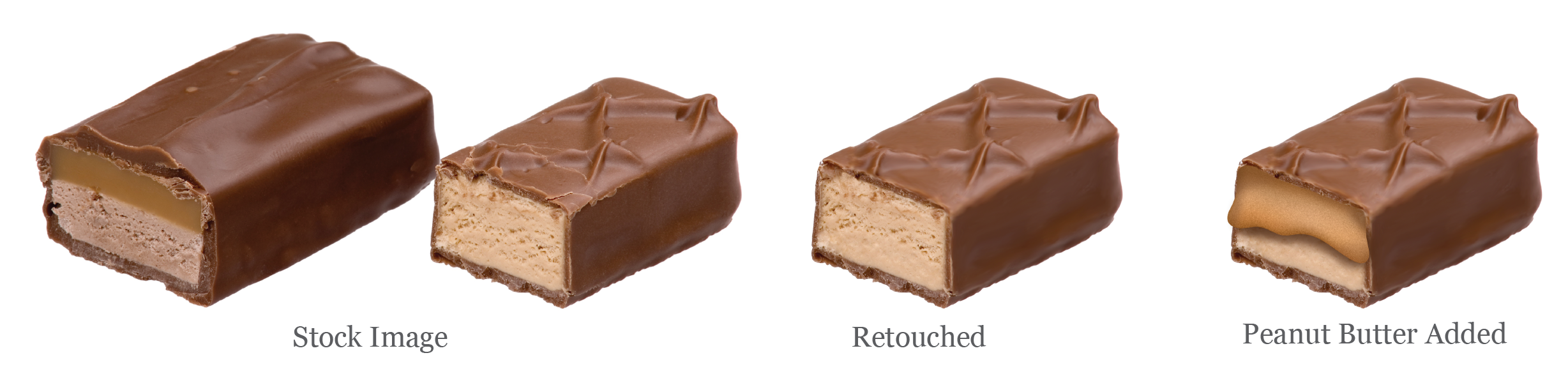 Mockups The initial mockups felt a little bit plain and underdone. As much as I liked the background pattern, it was perhaps a little too simple and the wrapper needed more modification and more elements. 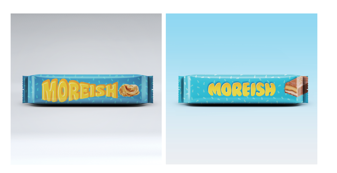 Final candy bar design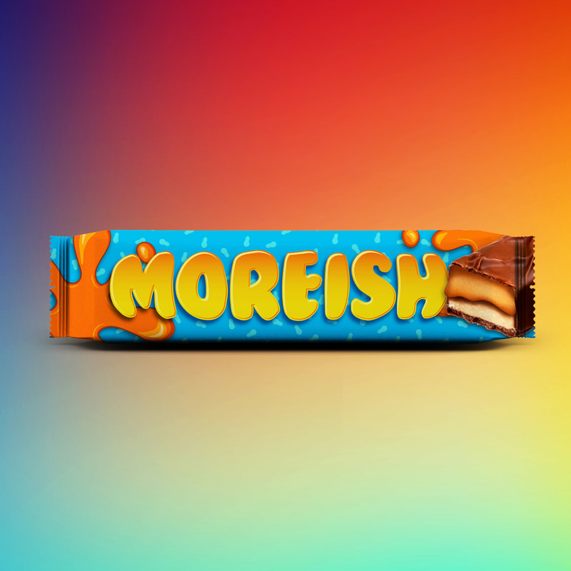
0 Comments
Leave a Reply. |
AuthorWrite something about yourself. No need to be fancy, just an overview. Archives
December 2017
Categories |
 RSS Feed
