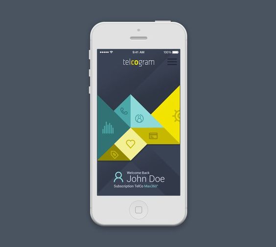
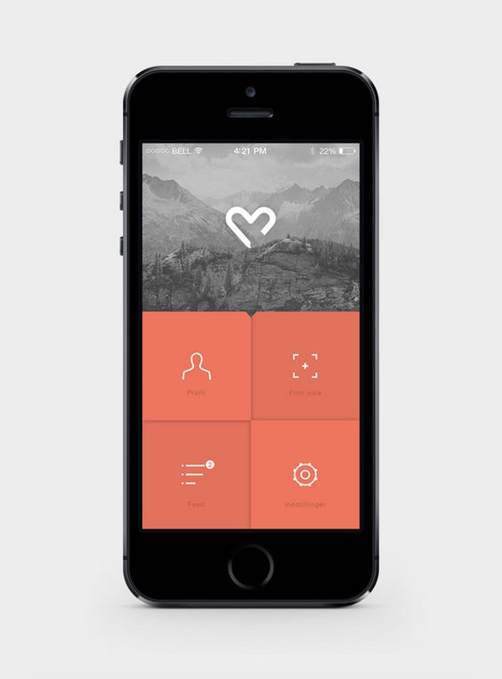
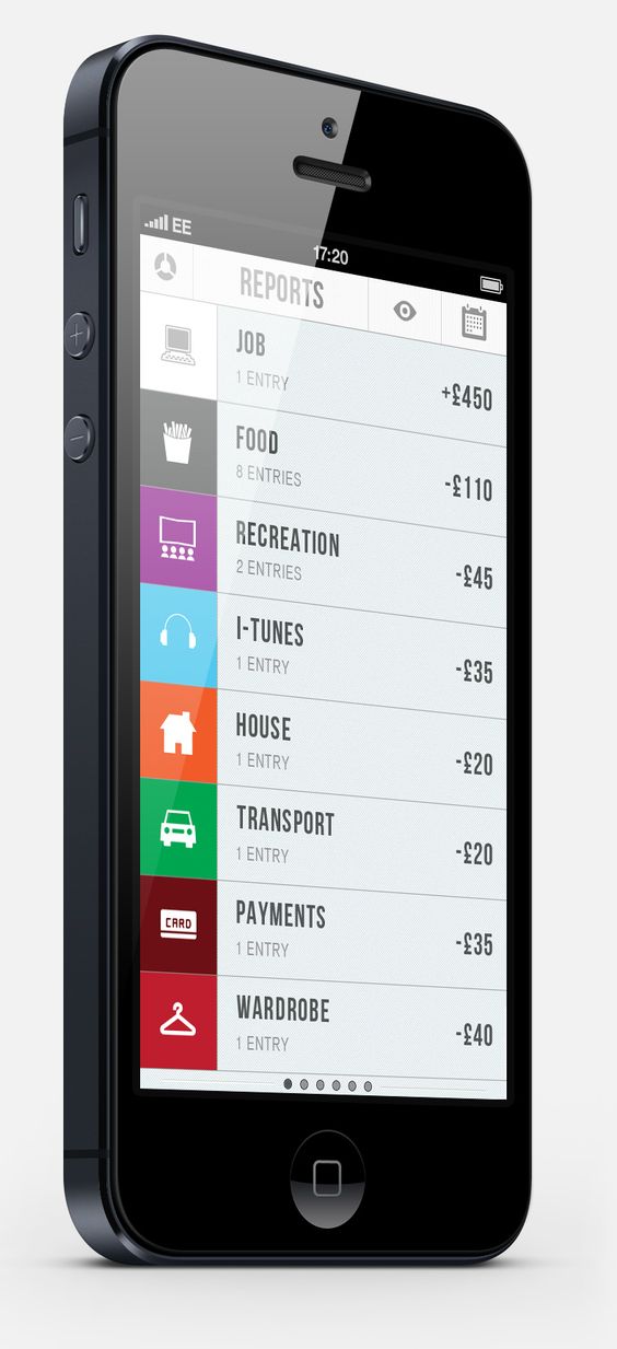
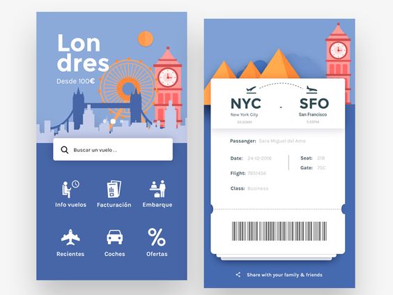
 Think about how you can use the element of shape. 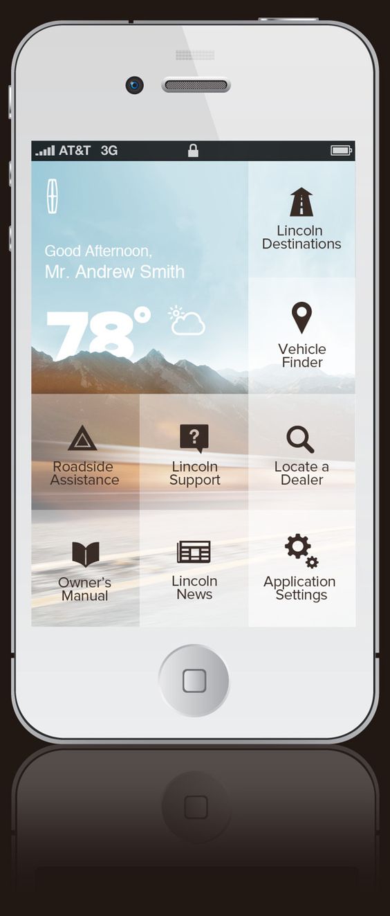 Experiment with adjusting opacity levels (making things semi-transparent)
Use simple icons.
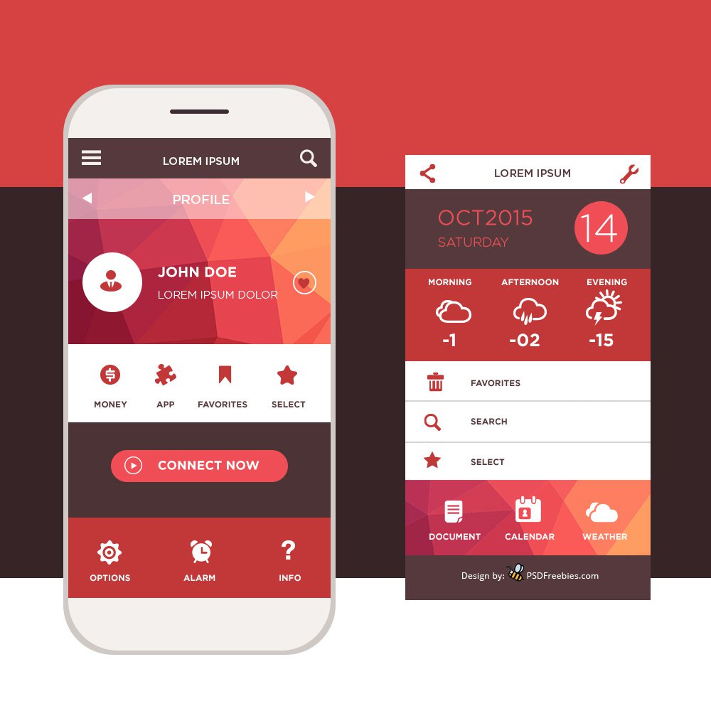
Make sure all of your app designs have the same look/feel and work together as a unit. Always do more researchThese are just a few ideas for your app design. But you can also look at the apps you have downloaded on your own phone for inspiration. Think about what type of app pages you want to design. A login page? A profile page? An information page? etc.
0 Comments
Tips and tricks on how to design an effective billboardSix Words or Less is ideal. Considering we’re on the move when we read billboards, we don’t have a lot of time to take them in. Six seconds has been touted as the industry average for reading a billboard. So, around six words is all you should use to get the message across. You can push this to a few more words depending on their length and ease of reading, but as a rule of thumb, less is more here. 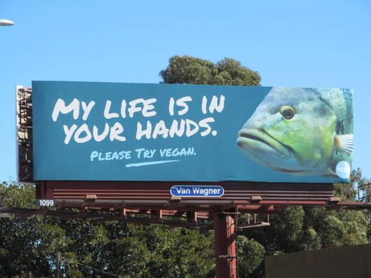 Get Noticed, But Don’t Be a Huge Distraction. Most of the time, billboards are aimed at drivers, bikers, cyclists or pedestrians (which is why you have just a few seconds to get a message across). This causes an interesting dilemma for the advertiser; you want to get noticed, but you don’t want to be responsible for major, or even minor, accidents. 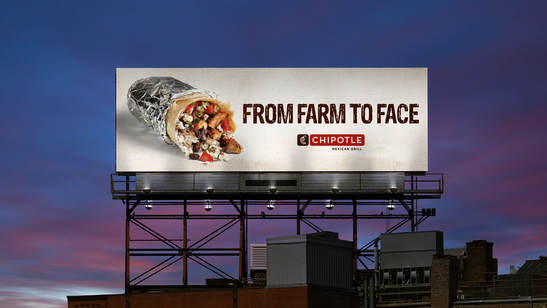 This is Not the Place for Direct Response. There are some truly awful billboards covered in phone numbers and website addresses. And without a doubt, 99.9% of the people who actually read the billboard will not call or visit the website! A billboard is a secondary advertising medium, which means that it’s ideal for brand-building and supporting a campaign. 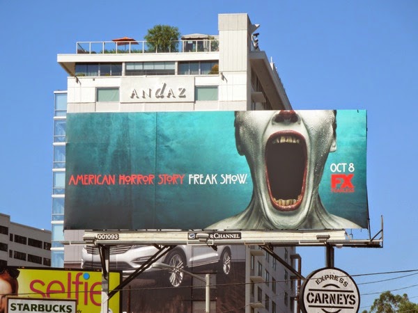 Be Smart, But Not Too Clever. A boring billboard will be ignored. A smart billboard will grab the attention and leave a lasting impression. A billboard that’s trying to be too clever, well, it will get lost on the audience. As a rule, you don’t want billboards to make people scratch their heads and wonder what is going on. Complex visual metaphors are no good here. They say advertising should be like a puzzle to solve, it gives the audience a sense of fulfillment to know they figured it out. But billboards should be much simpler than that. Be smart, have fun, but don’t give people puzzles that Einstein would have trouble solving. 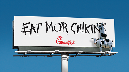 Don’t Say It, Show It. Get creative with your billboard ideas. There is no reason that it just has to be a large, simple print ad. This is your opportunity to do something eye-catching and memorable, so go for it! You have some premium space to work with here. It costs a lot of money to put a billboard up, and keep it up, so use every inch of the space wisely. If you are using a headline that explains your visual, you're wasting words. If your imagery is dull, or doesn't relate to the product, you are squandering your opportunity. 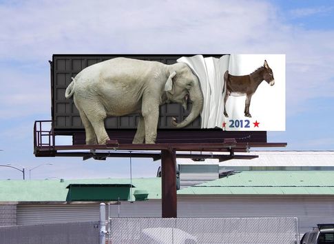 Keep It Simple, Stupid A billboard is a quick read. Most of the time, you see it as you drive past it at 55mph in your car, so it needs to get the message across in the most effective way. This is not the place for art directors to experiment with complex layouts, or for copywriters to wax poetic. The billboard is a punch in the face, and the simpler it is, the more powerful that punch. 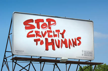 Do The "Arm's Length" Test So, you have followed all of the rules above. You've designed yourself one fantastic billboard. It's clean, it's concise, it's got contrasting colors, it's interesting, and it will work. But will it be seen? Will it be read, and understood? Here's a quick test to ensure you are not wasting everyone's time and money. Print out your billboard to the size of a business card. Now, hold it out at arm's length. Are you still getting everything you were when it was displayed on your 27" monitor? If not, go in and refine it. This needs to pop. And remember, you have about 5-10 seconds to get your message across. Go. 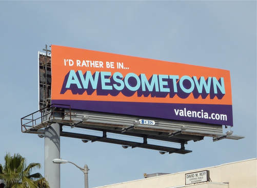 |
AuthorWrite something about yourself. No need to be fancy, just an overview. Archives
December 2017
Categories |
 RSS Feed
