Magazine spreads due today!
0 Comments
In class today:
Things to consider in your magazine spread: Compelling headline: Does it pull the reader in? Subheadline: Does it give the reader information about what the article is ABOUT? Pull-out quote: Is it designed in a thoughtful way? Did you choose an interesting typeface? Margins and columns: Is your magazine designed on some type of grid? Does your text have enough padding on the edges of the columns? Images: Did you use high quality images that are crisp? Design: Is the design more than just words on a page with placed images? In class today:
New typography vocab words: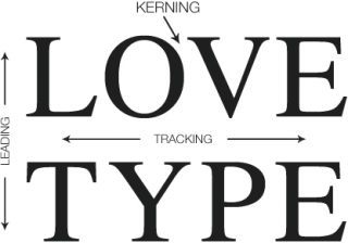 Leading = The amount of spacing between lines of text. To adjust your leading, you can highlight your text with the T tool and hold option and use your up and down arrow keys to adjust. Kerning = the amount of space in-between individual letters. To adjust your kerning, highlight the two letters you want to kern with the T tool and hold option and use your left or right arrow keys to adjust. Tracking = The amount of space between all letters in a word. To adjust your tracking, highlight the words, or lines of text you want to kern with the T tool and hold option and use your left or right arrow keys to adjust. Spread = two 8.5 x 11 pieces of paper right next to each other. Example of a full page spread below. 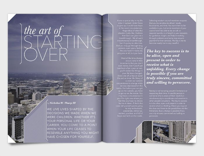  I'M BACKKKKKKK. In class today:
SORRY I'M NOT THERE TODAY. You clearly know I've been sick this week :( In class today:
Examples of pull out quotes. A pull quote is a key phrase, quotation, or excerpt that has been pulled from an article and used as a graphic element, serving to entice readers into the article or to highlight a key topic. It is typically placed in a larger or distinctive typeface and on the same page. Magazine Design continued...
Read the assignment details for the magazine design on the assignments page here. There are also notes on how to correctly set up your document.
 Move your way down the list as you complete assignments...
|
 RSS Feed
